From timeless landmarks to neon wonders, signs don’t just mark places – they make history!
Where Would We Be Without Signs?
Imagine a world with no signs. No stop signs, no billboards, no giant glowing letters screaming “Eat here!” Chaos, right? Signs are the unsung heroes of cities, streets, and businesses. They tell us where to go, what to buy, and sometimes, they just show off (looking at you, Times Square).
But some signs go beyond their practical purpose – they become legends. In this article, we’ll explore the most iconic signs in history, how they came to be, and what they teach us about great sign design.
Ready to learn from the masters? Let’s dive in!
1. The Hollywood Sign – Keeping It Simple
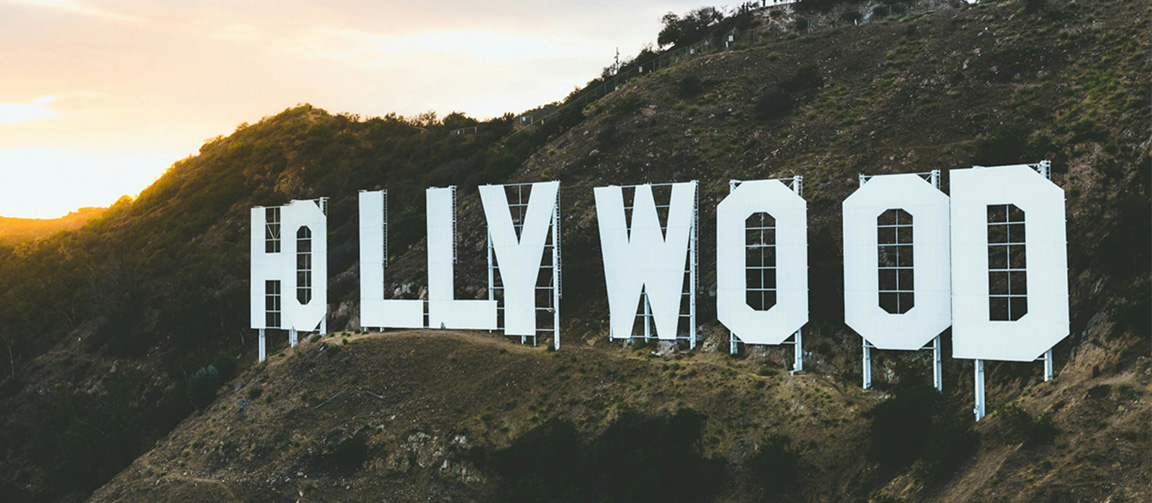
The Hollywood sign didn’t start as a symbol of glitz and glamor. Back in 1923, it was just a giant billboard for a housing development called “Hollywoodland.” Over time, the “land” was dropped, and the sign became the ultimate symbol of the entertainment industry.
What We Learn:
- Simplicity is timeless. Big, bold letters with a clean design still work a century later.
- Location matters. Perched high in the hills, it grabs your attention from miles away.
Sign Pro Tip: Go big, go bold. When designing large-scale signage, think clean fonts, strong contrast, and high visibility. The hills are optional.
2. The Las Vegas Neon Signs – When Bigger (and Brighter) is Better
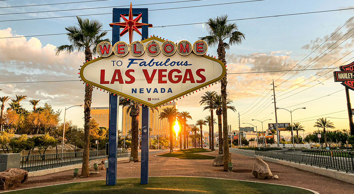
Las Vegas is basically the Disneyland for signs. From the 1930s to today, neon lights have turned the Vegas Strip into a glowing wonderland. The Welcome to Fabulous Las Vegas sign is a classic, and neon art continues to attract millions of tourists.
What We Learn:
- Bright colors and lighting grab attention like nothing else.
- Bigger is better – if you’re in the right place. Las Vegas taught us that signs can be entertainment too.
Sign Pro Tip: Experiment with lighting. Neon, LEDs, and illuminated signs add instant wow-factor. Want to stand out? Light it up like Vegas.
3. Times Square – The King of Digital Signs
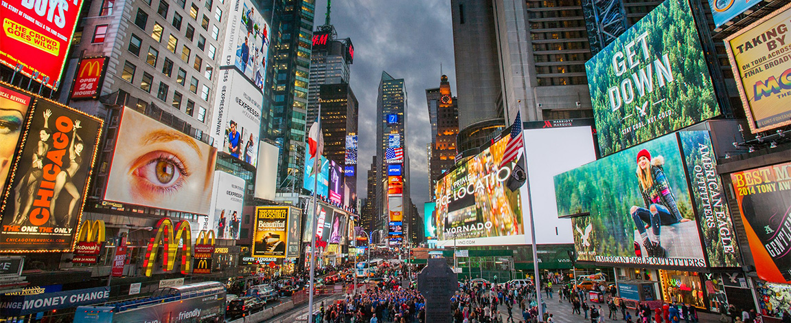
If Hollywood is about dreams, Times Square is about making a statement. Times Square signs have been grabbing eyeballs since the early 1900s. From the first illuminated billboards to the LED behemoths of today, these signs define the NYC skyline.
What We Learn:
- Innovation keeps you relevant. Static signs were replaced with dynamic, digital displays to keep up with the times.
- Placement is everything. Times Square works because it’s the spot to be seen.
Sign Pro Tip: Think dynamic. Digital signage isn’t just for the big guys anymore. Even small businesses can use LEDs and motion graphics to turn heads.
Ready to showcase your passion for signage? Visit the Signspen Store and grab your favorite sign-themed apparel and gear. From witty tees to must-have accessories, we’ve got everything a true sign enthusiast needs.
4. Route 66 Road Signs – Nostalgia Done Right
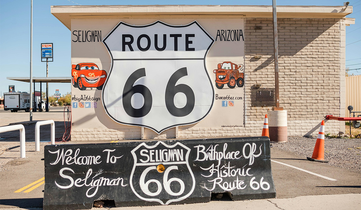
Route 66 signs remind us of the golden age of American road trips. Simple and bold, they guided travelers along “The Mother Road” and became symbols of freedom, adventure, and vintage Americana.
What We Learn:
- Signs tell stories. A well-designed sign connects emotionally with its audience.
- Functionality meets design. These signs were practical yet memorable – a combo every sign designer should aim for.
Sign Pro Tip: Design for both purpose and nostalgia. A great sign can guide the way and create memories.
5. The London Underground Signs – A Masterclass in Clarity
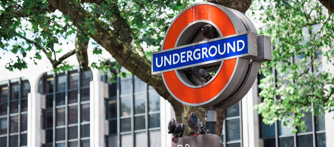
The London Tube’s roundel logo and map design are legends of clarity. First introduced in 1908, the design focuses on readability and functionality, which is why it still looks modern today.
What We Learn:
- Legibility is king. Clear, sans-serif fonts are timeless and easy to read.
- Consistency builds trust. The London Underground uses the same design language everywhere.
Sign Pro Tip: Keep it clean and readable. If it’s a wayfinding sign, make sure it’s legible from a distance and under pressure (yes, stressed commuters count!).
6. Coca-Cola Signs – Branding That Shines Everywhere
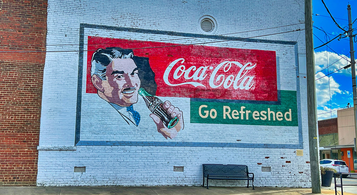
Coca-Cola didn’t just build a brand – they turned their signs into global icons. From vintage painted murals to modern illuminated billboards, Coca-Cola’s red and white script logo is instantly recognizable anywhere in the world.
What We Learn:
- Consistency builds icons. Coca-Cola never strays far from its classic font and colors.
- Signs are branding tools. When done right, your sign isn’t just an ad – it’s an identity.
Sign Pro Tip: Stick to a color palette and font style that defines your brand. Familiarity breeds trust (and more customers).
BONUS: Your Next Sign Could Be Iconic!
Here’s the thing – every iconic sign started as just an idea. Whether you’re designing for a small shop or a massive brand, your sign could be the next big thing.
So what makes a great sign?
- Bold, clear design
- Thoughtful use of lighting
- Emotional connection with your audience
- Innovation and creativity
Take inspiration from these icons, but don’t be afraid to add your own spin. After all, signage is art that works – so make it shine.
Final Thoughts: Signs That Leave a Mark
Signs aren’t just tools for navigation or advertising – they’re landmarks, storytellers, and sometimes, works of art. From Hollywood to Times Square, the greatest signs share a few things: they’re bold, beautiful, and unforgettable. Subscribe to the Signspen Newsletter and stay connected.
So, next time you’re designing a sign, think big. Whether it’s a neon masterpiece, a clean wayfinding solution, or a quirky storefront logo, aim for greatness. You never know – your work might just make history.

