Typography is more than just choosing a font, it’s a critical component of sign design that directly impacts visibility, brand perception, and effectiveness. Whether you’re fabricating an eye-catching storefront sign or crafting a wayfinding system, the right typography ensures that messages are read quickly and remembered.
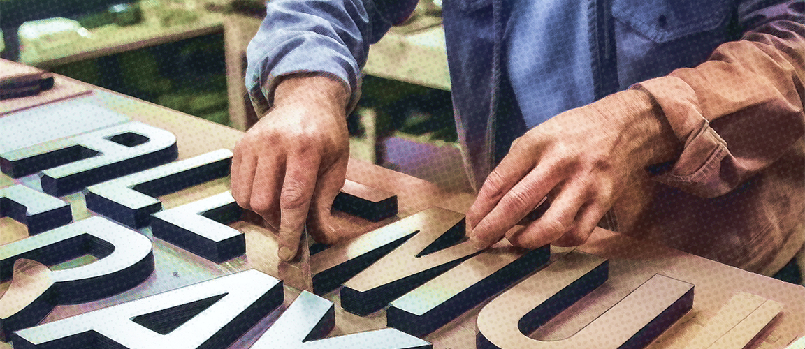
For sign professionals, typography isn’t just about aesthetics; it’s about functionality and execution. Often, we deal with customer-supplied fonts, beautiful for digital branding but ill-suited for fabrication, mounting, or illumination. Logos often include fonts that are too thin, overly decorative, or lacking the structure needed for real-world applications. Our challenge? Modifying typography without compromising brand identity.
Beyond design, typography plays a role in customer perception and engagement. A font choice can make a business feel modern and professional or outdated and difficult to read. Additionally, research has shown that typographic readability is crucial for diverse demographics, including individuals with visual impairments and aging populations. Typography is the silent salesperson of every sign.
Factors Influencing Font Choice in Sign Design
Choosing the right font involves a combination of readability, aesthetics, and practicality. Here’s what sign professionals should consider:
Legibility and Readability
- Signs are often read from a distance, at speed, or in motion.
- Fonts should be clear, free of excessive decoration, and have distinct letterforms.
- Avoid narrow, condensed, or script fonts unless they are used at large sizes.
- Research suggests that serif fonts do not necessarily improve readability over sans-serif fonts, particularly for individuals with certain cognitive or visual impairments.
- Readability challenges for older individuals can be mitigated not just by increasing font size, but also by optimizing type classification, layout, and word form strategies.
Aesthetics and Branding
- Fonts should align with the business’s personality, modern, elegant, bold, or playful.
- Customers often bring fonts from logos that were never designed for signage, modifications may be necessary.
Environmental Considerations
- Viewing distance: How far will the sign be read from? Signs placed on high-speed roads need fonts that are clear, bold, and quickly readable. Drivers have only a few seconds to process information, so the font style, size, and text quantity must be optimized for rapid recognition.
- Lighting conditions: Fonts used in well-lit areas might differ from those in dimly lit spaces.
- Background contrast: The sign must stand out from its surroundings while maintaining aesthetic appeal.
- Surface curvature and material reflectivity: These factors can impact how readable a sign is from different angles.
- Placement and Positioning: Signage should be positioned to maximize visibility at typical viewing heights for both pedestrians and drivers. Poor placement can make even the best-designed signs ineffective.
When Customer-Supplied Fonts Don’t Work
- Many client-provided fonts are too thin, too intricate, or too condensed.
- Modifications might be needed:
- Increase stroke thickness to accommodate LED modules and improve legibility.
- Adjust kerning and spacing to enhance readability and fabrication feasibility.
- Ensure letters are large enough for fabrication, mounting, and LED integration.
Types of Fonts Suitable for Signage
Sans-Serif Fonts: The Industry Standard
- Examples: Helvetica, Arial, Futura, Montserrat
- Clean, simple, and highly legible at any size.
- Ideal for wayfinding, outdoor, and retail signage.
Serif Fonts: When Tradition Matters
- Examples: Garamond, Bodoni, Baskerville
- Works best for professional, historic, or high-end signage.
- Not ideal for LED-lit signs due to thin strokes that may not illuminate evenly.
Script & Display Fonts: Use with Caution
- Decorative fonts can add flair, but overuse hinders readability.
- Best for branding elements and short messages.
- Consider modifications to stroke thickness for better visibility.
Adjusting Customer Fonts for Signage
- Increase stroke thickness to avoid letters looking too thin when fabricated.
- Ensure spacing (kerning) is optimized for legibility from a distance.
- Avoid fonts with excessive details that may be difficult to cut, mount, or illuminate.
Design Principles for Effective Signage Typography
Hierarchy & Information Flow
- Headline fonts should be bold and attention-grabbing.
- Supporting text should be smaller but still legible.
- Use consistent spacing and alignment to guide the reader’s eye.
Color & Contrast
- High contrast between text and background is essential.
- Avoid low-contrast color pairings (e.g., red on black, blue on green).
- Lighted signs require additional contrast adjustments to compensate for nighttime conditions.
Spacing & Layout
- Letter-spacing (kerning) should not be too tight or too loose.
- Too much text on a sign makes it hard to read, less is more.
- Negative space is just as important as the letters themselves.
Love Signs? Check out Signspen’s collection of typography-inspired apparel and gear, designed for sign pros who live and breathe great lettering! Visit Signspen Store and wear your passion with pride!
Best Practices for Digital vs. Physical Signage
- Digital screens require fonts that scale well and remain legible across different screen sizes.
- Dimensional signage demands consideration for durability, fabrication, and lighting.
- LED signs require adjusted stroke thickness to accommodate lighting elements.
Typography Mistakes to Avoid in Signage
- Using overly decorative fonts in functional signage.
- Failing to adjust spacing for legibility.
- Poor contrast reducing visibility.
- Ignoring sign regulations, codes and accessibility standards.
Case Studies & Real-World Examples
Typography can make or break a sign’s effectiveness. Let’s take a look at real-world examples where font adjustments led to major improvements in readability and branding impact.
Before & After: Refining Customer Fonts for Better Signage
- A retail client insisted on using an ultra-thin script font from their branding. While elegant on print, it was illegible on their LED-lit storefront sign. Solution? Increasing stroke thickness and slightly adjusting letter spacing while maintaining the brand’s identity.
- A corporate building sign had too much text in a small space, making it hard to read from a distance. By prioritizing key information and optimizing font size, readability improved dramatically.
Wayfinding Signage: Enhancing Legibility in High-Stress Environments
- An airport redesigned its wayfinding signs after travelers reported difficulties in reading directions quickly. The solution? Switching to a high-contrast sans-serif font with bolder letters and increasing spacing for faster recognition.
- A highway sign was nearly impossible to read at high speeds due to a serif font with excessive decorative strokes. After testing, a clean, bold sans-serif font with optimized text height drastically improved readability.
Takeaway: Even small tweaks to typography can lead to huge readability gains, especially in functional signage where speed and clarity are crucial.
The Future of Typography in Signage
The world of signage is evolving rapidly, and typography is no exception. Here’s what’s shaping the future of sign lettering:
AI-Driven Font Optimization
- Emerging AI tools are analyzing legibility patterns and adjusting fonts dynamically for maximum readability across different lighting and distances.
- Smart software can suggest typography improvements based on contrast, spacing, and sign placement, a game-changer for designers and fabricators.
Smart Signs & Digital Typography
- Interactive digital signs are now adapting font sizes in real-time based on viewing distance and user interaction.
- Fonts in augmented reality (AR) environments are being developed to ensure optimal clarity across various digital displays.
Custom Typefaces for Signage
- More brands are commissioning bespoke fonts tailored specifically for signage, ensuring their visual identity translates seamlessly across physical and digital spaces.
- Expect adaptive typefaces that adjust weight and spacing automatically depending on the material, lighting, and positioning.
Bottom Line: Typography in signage is heading toward a more intelligent, adaptive, and custom-tailored future, making it easier than ever to balance brand identity with functional clarity.
Conclusion: Elevating Signage with the Right Typography
Typography is a fundamental part of signage design, and sign professionals know that a font isn’t just a style, it’s a structural decision. Whether you’re modifying customer fonts for better visibility, ensuring proper illumination, or selecting the perfect typeface for a wayfinding system, the right typography enhances both the sign’s effectiveness and its longevity.
Show off your love for great signage typography! Check out Signspen’s collection of signage-inspired apparel and accessories and wear your passion for fonts loud and proud.
Got insights or experiences to share about typography in signage? We’d love to hear from you! Reach out to us, let’s keep the conversation going!